EDA of LISH MoA dataset
Importing libraries for EDA
# import libraries for EDA
import numpy as np
import pandas as pd
import matplotlib.pyplot as plt
import matplotlib.cm as cm
import matplotlib.patches as mpatches
import matplotlib.colors as colors
from matplotlib.pyplot import imshow
from IPython.display import display
import seaborn as sns
from PIL import Image
Dataset files description
-
train_features.csv - Features for the training set. Features g- signify gene expression data, and c- signify cell viability data. cp_type indicates samples treated with a compound (cp_vehicle) or with a control perturbation (ctrl_vehicle); control perturbations have no MoAs; cp_time and cp_dose indicate treatment duration (24, 48, 72 hours) and dose (high or low).
-
train_drug.csv - This file contains an anonymous drug_id for the training set only.
-
train_targets_scored.csv - The binary MoA targets that are scored (i-e Prediction of these targets will be taken into consideration).
-
train_targets_nonscored.csv - Additional (optional) binary MoA responses for the training data. Prediction of these targets will not be taken into consideration.
-
test_features.csv - Features for the test data. You must predict the probability of each scored MoA for each row in the test data.
-
sample_submission.csv - A submission file in the correct format.
#let's read the feature file
features = pd.read_csv('train_features.csv')
features.head()
| sig_id | cp_type | cp_time | cp_dose | g-0 | g-1 | g-2 | g-3 | g-4 | g-5 | ... | c-90 | c-91 | c-92 | c-93 | c-94 | c-95 | c-96 | c-97 | c-98 | c-99 | |
|---|---|---|---|---|---|---|---|---|---|---|---|---|---|---|---|---|---|---|---|---|---|
| 0 | id_000644bb2 | trt_cp | 24 | D1 | 1.0620 | 0.5577 | -0.2479 | -0.6208 | -0.1944 | -1.0120 | ... | 0.2862 | 0.2584 | 0.8076 | 0.5523 | -0.1912 | 0.6584 | -0.3981 | 0.2139 | 0.3801 | 0.4176 |
| 1 | id_000779bfc | trt_cp | 72 | D1 | 0.0743 | 0.4087 | 0.2991 | 0.0604 | 1.0190 | 0.5207 | ... | -0.4265 | 0.7543 | 0.4708 | 0.0230 | 0.2957 | 0.4899 | 0.1522 | 0.1241 | 0.6077 | 0.7371 |
| 2 | id_000a6266a | trt_cp | 48 | D1 | 0.6280 | 0.5817 | 1.5540 | -0.0764 | -0.0323 | 1.2390 | ... | -0.7250 | -0.6297 | 0.6103 | 0.0223 | -1.3240 | -0.3174 | -0.6417 | -0.2187 | -1.4080 | 0.6931 |
| 3 | id_0015fd391 | trt_cp | 48 | D1 | -0.5138 | -0.2491 | -0.2656 | 0.5288 | 4.0620 | -0.8095 | ... | -2.0990 | -0.6441 | -5.6300 | -1.3780 | -0.8632 | -1.2880 | -1.6210 | -0.8784 | -0.3876 | -0.8154 |
| 4 | id_001626bd3 | trt_cp | 72 | D2 | -0.3254 | -0.4009 | 0.9700 | 0.6919 | 1.4180 | -0.8244 | ... | 0.0042 | 0.0048 | 0.6670 | 1.0690 | 0.5523 | -0.3031 | 0.1094 | 0.2885 | -0.3786 | 0.7125 |
5 rows × 876 columns
There are 23814 experiment results and 876 features
#let's read the target scored file
targets_scored = pd.read_csv('train_targets_scored.csv')
It is called as target scored file because, predictions of these targets will be taken into consideration while computing loss.
targets_scored.head()
| sig_id | 5-alpha_reductase_inhibitor | 11-beta-hsd1_inhibitor | acat_inhibitor | acetylcholine_receptor_agonist | acetylcholine_receptor_antagonist | acetylcholinesterase_inhibitor | adenosine_receptor_agonist | adenosine_receptor_antagonist | adenylyl_cyclase_activator | ... | tropomyosin_receptor_kinase_inhibitor | trpv_agonist | trpv_antagonist | tubulin_inhibitor | tyrosine_kinase_inhibitor | ubiquitin_specific_protease_inhibitor | vegfr_inhibitor | vitamin_b | vitamin_d_receptor_agonist | wnt_inhibitor | |
|---|---|---|---|---|---|---|---|---|---|---|---|---|---|---|---|---|---|---|---|---|---|
| 0 | id_000644bb2 | 0 | 0 | 0 | 0 | 0 | 0 | 0 | 0 | 0 | ... | 0 | 0 | 0 | 0 | 0 | 0 | 0 | 0 | 0 | 0 |
| 1 | id_000779bfc | 0 | 0 | 0 | 0 | 0 | 0 | 0 | 0 | 0 | ... | 0 | 0 | 0 | 0 | 0 | 0 | 0 | 0 | 0 | 0 |
| 2 | id_000a6266a | 0 | 0 | 0 | 0 | 0 | 0 | 0 | 0 | 0 | ... | 0 | 0 | 0 | 0 | 0 | 0 | 0 | 0 | 0 | 0 |
| 3 | id_0015fd391 | 0 | 0 | 0 | 0 | 0 | 0 | 0 | 0 | 0 | ... | 0 | 0 | 0 | 0 | 0 | 0 | 0 | 0 | 0 | 0 |
| 4 | id_001626bd3 | 0 | 0 | 0 | 0 | 0 | 0 | 0 | 0 | 0 | ... | 0 | 0 | 0 | 0 | 0 | 0 | 0 | 0 | 0 | 0 |
5 rows × 207 columns
There are 23814 experiment results and 207 scored MoA's
#let's read the target non-scored file
targets_non_scored = pd.read_csv('train_targets_nonscored.csv')
It is called as target non-scored file because, predictions of these targets will not be taken while computing loss.
targets_non_scored.head()
| sig_id | abc_transporter_expression_enhancer | abl_inhibitor | ace_inhibitor | acetylcholine_release_enhancer | adenosine_deaminase_inhibitor | adenosine_kinase_inhibitor | adenylyl_cyclase_inhibitor | age_inhibitor | alcohol_dehydrogenase_inhibitor | ... | ve-cadherin_antagonist | vesicular_monoamine_transporter_inhibitor | vitamin_k_antagonist | voltage-gated_calcium_channel_ligand | voltage-gated_potassium_channel_activator | voltage-gated_sodium_channel_blocker | wdr5_mll_interaction_inhibitor | wnt_agonist | xanthine_oxidase_inhibitor | xiap_inhibitor | |
|---|---|---|---|---|---|---|---|---|---|---|---|---|---|---|---|---|---|---|---|---|---|
| 0 | id_000644bb2 | 0 | 0 | 0 | 0 | 0 | 0 | 0 | 0 | 0 | ... | 0 | 0 | 0 | 0 | 0 | 0 | 0 | 0 | 0 | 0 |
| 1 | id_000779bfc | 0 | 0 | 0 | 0 | 0 | 0 | 0 | 0 | 0 | ... | 0 | 0 | 0 | 0 | 0 | 0 | 0 | 0 | 0 | 0 |
| 2 | id_000a6266a | 0 | 0 | 0 | 0 | 0 | 0 | 0 | 0 | 0 | ... | 0 | 0 | 0 | 0 | 0 | 0 | 0 | 0 | 0 | 0 |
| 3 | id_0015fd391 | 0 | 0 | 0 | 0 | 0 | 0 | 0 | 0 | 0 | ... | 0 | 0 | 0 | 0 | 0 | 0 | 0 | 0 | 0 | 0 |
| 4 | id_001626bd3 | 0 | 0 | 0 | 0 | 0 | 0 | 0 | 0 | 0 | ... | 0 | 0 | 0 | 0 | 0 | 0 | 0 | 0 | 0 | 0 |
5 rows × 403 columns
There are 23814 experiment results and 403 non-scored MoA's
1. Introduction and inspection of train and test columns
1.1 Inspection of train columns / features
features.columns
Index(['sig_id', 'cp_type', 'cp_time', 'cp_dose', 'g-0', 'g-1', 'g-2', 'g-3',
       'g-4', 'g-5',
       ...
       'c-90', 'c-91', 'c-92', 'c-93', 'c-94', 'c-95', 'c-96', 'c-97', 'c-98',
       'c-99'],
      dtype='object', length=876)
# total number of columns
print('Number of columns {}'.format(len(features.columns)))
Number of columns 876
So there are total 875 features one of the column has unique identifiers for each row. The breakdown of features is as follows.
features.head()
| sig_id | cp_type | cp_time | cp_dose | g-0 | g-1 | g-2 | g-3 | g-4 | g-5 | ... | c-90 | c-91 | c-92 | c-93 | c-94 | c-95 | c-96 | c-97 | c-98 | c-99 | |
|---|---|---|---|---|---|---|---|---|---|---|---|---|---|---|---|---|---|---|---|---|---|
| 0 | id_000644bb2 | trt_cp | 24 | D1 | 1.0620 | 0.5577 | -0.2479 | -0.6208 | -0.1944 | -1.0120 | ... | 0.2862 | 0.2584 | 0.8076 | 0.5523 | -0.1912 | 0.6584 | -0.3981 | 0.2139 | 0.3801 | 0.4176 |
| 1 | id_000779bfc | trt_cp | 72 | D1 | 0.0743 | 0.4087 | 0.2991 | 0.0604 | 1.0190 | 0.5207 | ... | -0.4265 | 0.7543 | 0.4708 | 0.0230 | 0.2957 | 0.4899 | 0.1522 | 0.1241 | 0.6077 | 0.7371 |
| 2 | id_000a6266a | trt_cp | 48 | D1 | 0.6280 | 0.5817 | 1.5540 | -0.0764 | -0.0323 | 1.2390 | ... | -0.7250 | -0.6297 | 0.6103 | 0.0223 | -1.3240 | -0.3174 | -0.6417 | -0.2187 | -1.4080 | 0.6931 |
| 3 | id_0015fd391 | trt_cp | 48 | D1 | -0.5138 | -0.2491 | -0.2656 | 0.5288 | 4.0620 | -0.8095 | ... | -2.0990 | -0.6441 | -5.6300 | -1.3780 | -0.8632 | -1.2880 | -1.6210 | -0.8784 | -0.3876 | -0.8154 |
| 4 | id_001626bd3 | trt_cp | 72 | D2 | -0.3254 | -0.4009 | 0.9700 | 0.6919 | 1.4180 | -0.8244 | ... | 0.0042 | 0.0048 | 0.6670 | 1.0690 | 0.5523 | -0.3031 | 0.1094 | 0.2885 | -0.3786 | 0.7125 |
5 rows × 876 columns
Feature information is as follows:
1) g- signify gene expression data.
2) c- signify cell viability data.
3) cp-type represents the carrier through which cell was treated with the dose.
4) cp_time indicates treatment duration (24, 48, 72 hours)
5) cp_dose indicates dose (high or low)
6) sig_id represents unique identifier for each experiment.
Description of features:
1) Gene expression (g-) feature : It is the process by which information from a gene is used in the synthesis of a functional gene product. These products are often proteins. In short, the mechanism of action of the 207 targets in this study will activate some genes, gene expression will take place and byproducts (proteins) will be synthesized.
2) Cell viability (c-) feature :A viability assay is an assay that is created to determine the ability of organs, cells or tissues to maintain or recover a state of survival. Viability can be distinguished from the all-or-nothing states of life and death by the use of a quantifiable index that ranges between the integers of 0 and 1 or, if more easily understood, the range of 0% and 100%. Viability can be observed through the physical properties of cells, tissues, and organs.
3) cp-type feature : indicates samples treated with a compound, trt_cp samples treated with the compounds.
4) cp-time feature : indicate treatment duration (24, 48, 72 hours)
5) cp-dose feature : indicate dose level.
6) sig_id : unique identifier for each sample.
count1 = 0
count2 = 0
for i in features.columns:
    if 'g-' in i:
        count1+=1
    if 'c-' in i:
        count2+=1

print('There are total {} gene expressions '.format(count1))
print('There are total {} cell viability features '.format(count2))
There are total 772 gene expressions
There are total 100 cell viability features
lets check if there are any NaN in the dataset
features.isnull().values.any()
False
So there are no NaN values, we don’t have to impute the data
lets check whether all the sig_id are unique
features['sig_id'].nunique()
23814
1.2 Inspection of target columns and features.
lets check the general types of MoA’s
set([ i.split('_')[-1] for i in targets_scored.columns if len(i.split('_')[-1])>2])
{'activator',
 'agent',
 'agonist',
 'analgesic',
 'antagonist',
 'anti-inflammatory',
 'antiarrhythmic',
 'antibiotic',
 'anticonvulsant',
 'antifolate',
 'antifungal',
 'antihistamine',
 'antimalarial',
 'antioxidant',
 'antiprotozoal',
 'antiviral',
 'blocker',
 'diuretic',
 'donor',
 'immunosuppressant',
 'inhibitor',
 'laxative',
 'local',
 'medium',
 'scavenger',
 'secretagogue',
 'sensitizer',
 'steroid',
 'stimulant'}
Above are the general categories to which the MoA’s belong.
for i in targets_scored.columns:
    if len(i.split('_')[-1])<2:
        print(i)
vitamin_b
Apart from that there is a MoA which belongs to vitamin category.
targets_scored.isnull().values.any()
False
So there are no NaN values in the target data.
2. Univariate Analysis
2.1 Univariate analysis of features.
lets have a look at categorical features first
# cp_type feature
features['cp_type'].value_counts(normalize=True).plot(kind='bar')
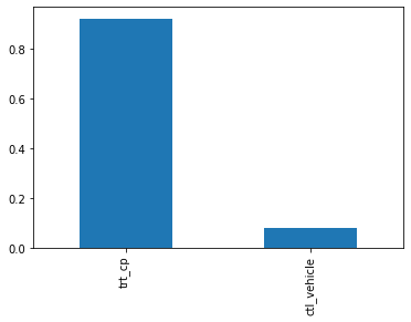
Most of the doses were give through trt_cp as compared to control pertubation treatements ctl_vehicle .
But still ctl_vehicle have no MoA i-e drugs given through that vehicle do not activate or deactivate any genes .
So we can actually write a condition which results in no MoA, if vehicle is ctl_vehicle .
# cp_dose
features['cp_dose'].value_counts().plot(kind='bar')
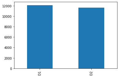
D1 vs D2, which encode high vs low doses. So approximately equal number of dosages belong to both of these categories.
Our data is balanced with respect to this feature.
# cp_time feature
features['cp_time'].value_counts().plot(kind='bar')
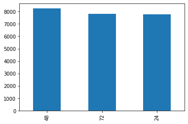
Three treatment duration categories of 24h, 48h, or 72h. Here also the data is balanced
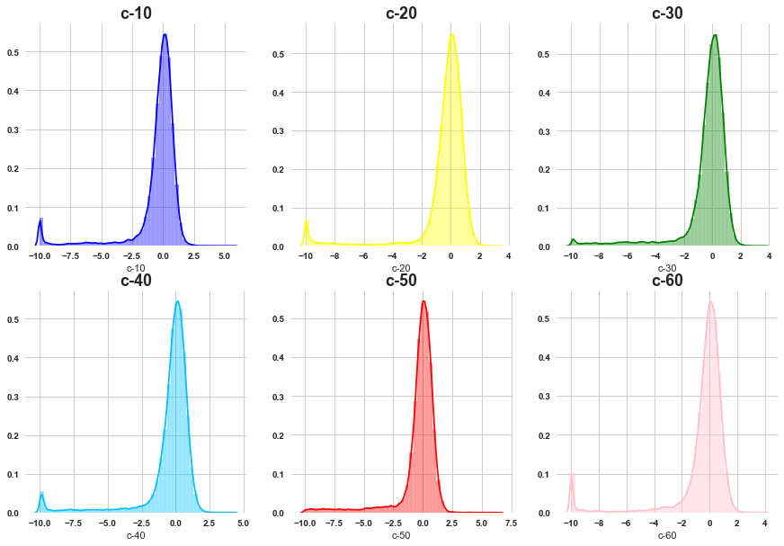
# gene expression features
grid_plot('g-10','g-100','g-200','g-400','g-500','g-600' )
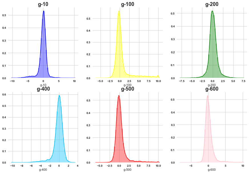
Most of the gene features are normally distributed although there is negligible amount of skewness present .
lets visualize the mean, min and max of all the gene expressions
min_of_g = [ min(features[i]) for i in features.columns if 'g-' in i ]
max_of_g = [ max(features[i]) for i in features.columns if 'g-' in i ]
mean_of_g = [ features[i].mean() for i in features.columns if 'g-' in i ]
std_of_g = [ features[i].std() for i in features.columns if 'g-' in i ]
grid_plot_stats(min_of_g, max_of_g, mean_of_g, std_of_g)
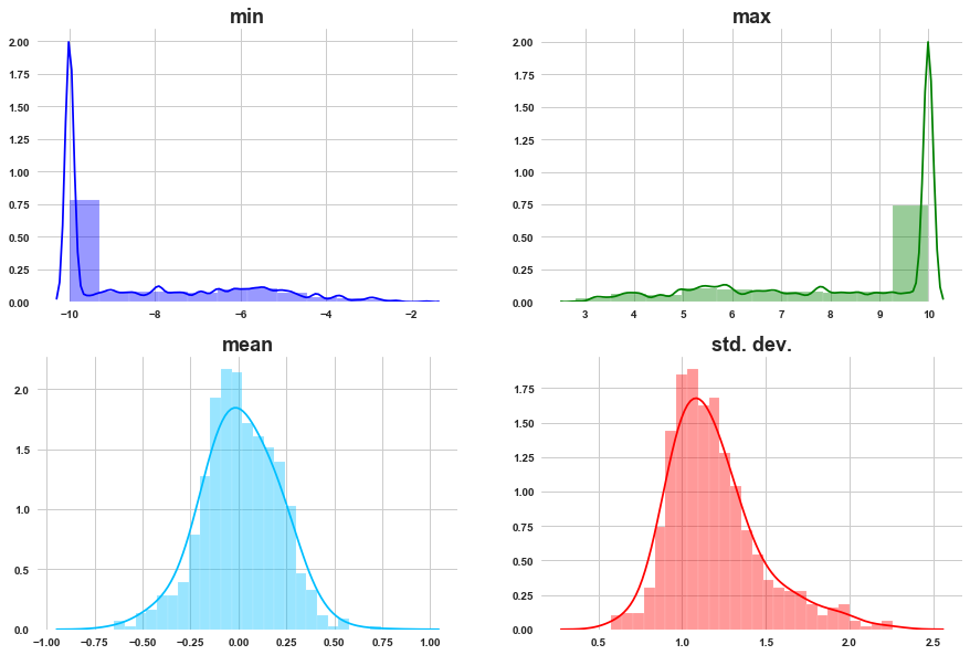
a) As we can see most of the g- get activated and deactivated with similar max and min activations.
b) The mean activation of gene distributions is normally distributed.
c) Most of the gene expressions have activation with standard deviation around 1. Std. dev. is normally distributed.
# cell viability features
grid_plot('c-10','c-20','c-30','c-40','c-50','c-60' )
All of them are skewed towards left side .
min_of_c = [ min(features[i]) for i in features.columns if 'c-' in i ]
max_of_c = [ max(features[i]) for i in features.columns if 'c-' in i ]
mean_of_c = [ features[i].mean() for i in features.columns if 'c-' in i ]
std_of_c = [ features[i].std() for i in features.columns if 'c-' in i ]
grid_plot_stats(min_of_c, max_of_c, mean_of_c, std_of_c)
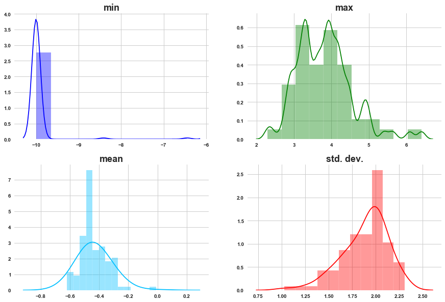
a) For most of the cell viability features min is towards -10.
b) Max values are showing bimodal distribution.
c) In last plot, we observed the distriution of cell viability is left skewed, beacuse of that the distribution means is shifted towards left side.
d) Std. dev. is left skewed.
2.2 Univariate analysis of target features
lets check the occurence of MoA’s
sum_of_MoA = [ sum(targets_scored[i])/len(targets_scored) for i in targets_scored.columns if i != 'sig_id' ]
len(sum_of_MoA)
206
res = sorted(zip(targets_scored.columns[1:], sum_of_MoA), key = lambda x: x[1])
MoA, count = zip(*res)
plt.figure(figsize=(7,7))
plt.scatter(count[-20:], MoA[-20:], color=sns.color_palette('Reds',20))
plt.title('Targets with higher presence in train samples', weight='bold', fontsize=15)
plt.xticks(weight='bold')
plt.yticks(weight='bold')
plt.xlabel('Count', fontsize=13)
plt.show()
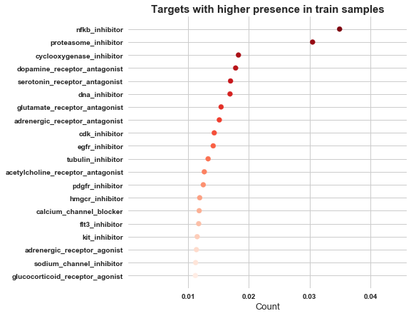
So MoA, nfkb_inhibitor has got higher presence, followed by proteasome_inhibitor and cyclooxygenase_inhibitor
3. Bivariate analysis
3.1 Relation within features
Let’s see correlation within gene expression features.
g_cols = [col for col in features.columns if 'g-' in col]

genes=features[g_cols]
plt.figure(figsize=(15,7))

corr = genes.corr()
mask = np.zeros_like(corr)
mask[np.triu_indices_from(mask)] = True
sns.heatmap(corr, mask=mask, cmap='coolwarm', alpha=0.9)
plt.title('Gene expression: Correlation', fontsize=15, weight='bold')
plt.show()
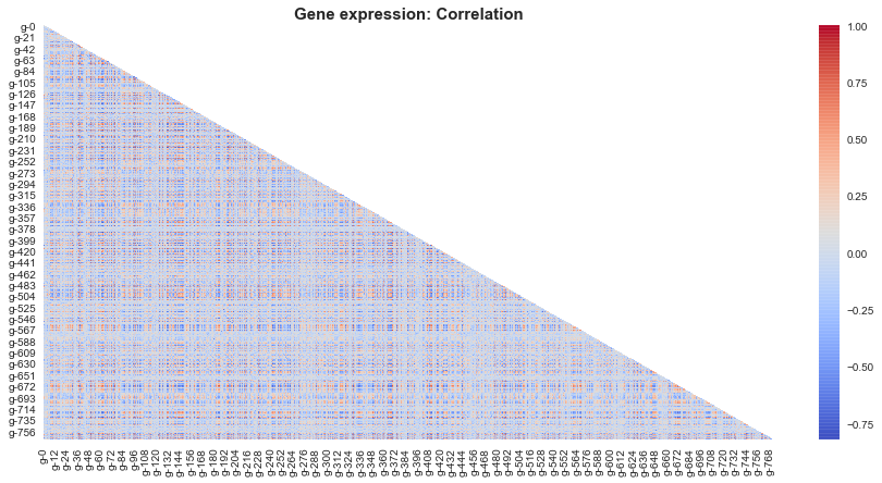
So there are certain red and blue pixels, which suggests that there is infact correlation between certain gene expressions .
Lets narrow down the image and see correlation between subset of features.
g_cols = [col for col in features.columns if 'g-' in col]

genes=features[g_cols[:30]]
plt.figure(figsize=(15,7))

corr = genes.corr()
mask = np.zeros_like(corr)
mask[np.triu_indices_from(mask)] = True
sns.heatmap(corr, mask=mask, cmap='coolwarm', alpha=0.9)
plt.title('Gene expression: Correlation', fontsize=15, weight='bold')
plt.show()
1) So as per this subset gene 8 and gene 10 seems to be positively correlated with most of the genes,
which implies when these genes are active most of the other genes are active and vice versa.
2) Similarly gene 0 ,gene 4 and gene 13 hold negative correlation with most of other genes.
Which implies when these genes are active most of the other genes are inactive and vice versa.
Let’s see correlation within cell viability features.
c_cols = [col for col in features.columns if 'c-' in col]

cells=features[c_cols]
plt.figure(figsize=(15,7))

corr = cells.corr()
mask = np.zeros_like(corr)
mask[np.triu_indices_from(mask)] = True
sns.heatmap(corr, mask=mask, cmap='coolwarm', alpha=0.9)
plt.title('Cell viiability: Correlation', fontsize=15, weight='bold')
plt.show()
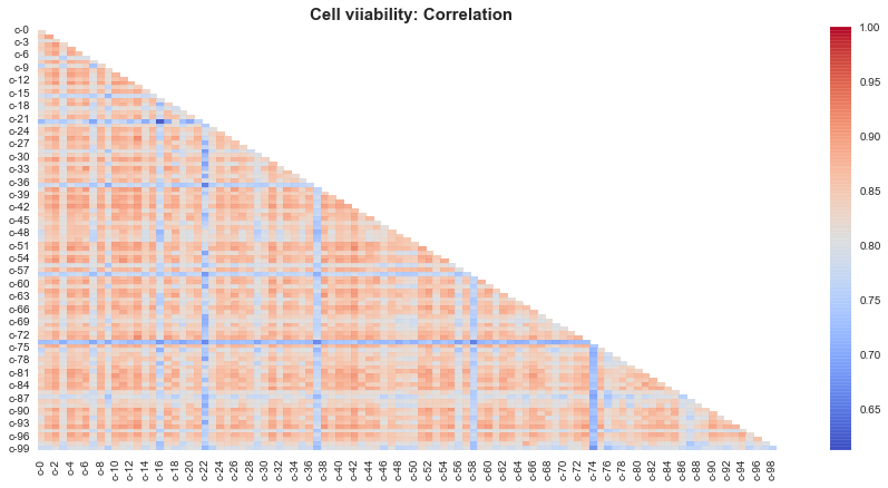
Mostly all of the cells show positively correlated behaviour with each other.
Expect cells 74, 58, 22 seem to be negatively correlated behaviour wiith other cells.
Note: The reason why cell viabiltiy shows such a strong correlation, is might be because the cell viability features are left skewed and that skewness in turn affects the correlation. Lets just see whether our guess is correct.
features.plot.scatter(x='c-12', y='c-72')
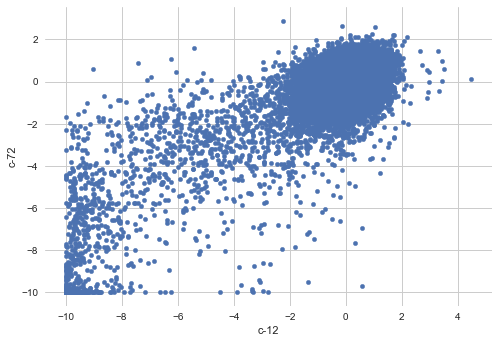
As we can see there is lump of outliers towards bottom left corner in above plot.
3.2 Relation between targets
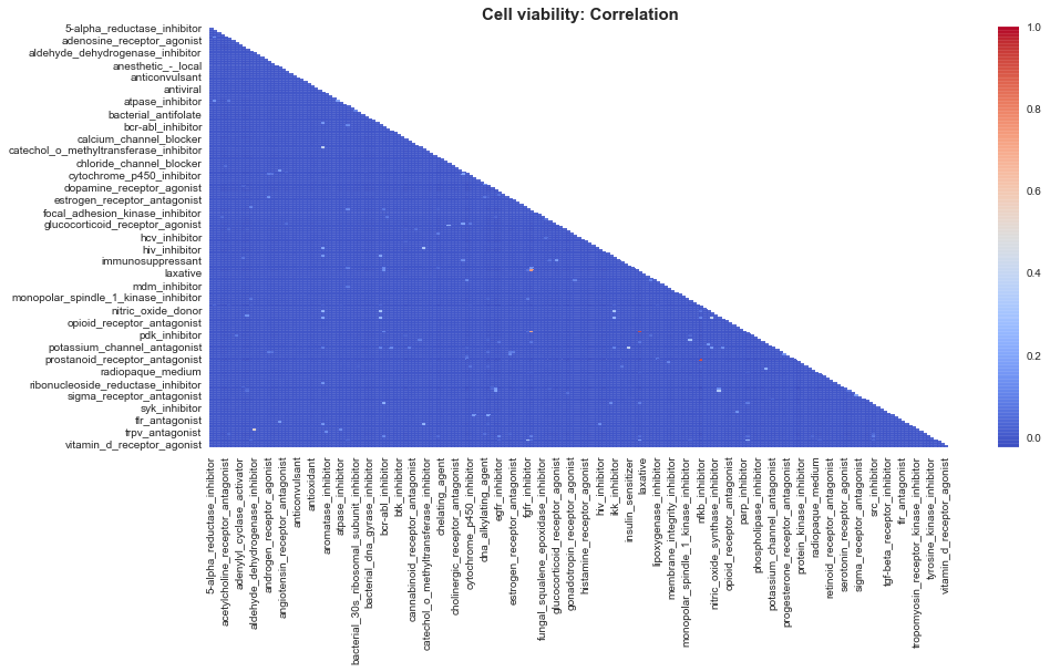
t_cols = targets_scored.columns[1:]
targets=targets_scored[t_cols]
plt.figure(figsize=(15,7))

corr = targets.corr()
mask = np.zeros_like(corr)
mask[np.triu_indices_from(mask)] = True
sns.heatmap(corr, mask=mask, cmap='coolwarm', alpha=0.9)
plt.title('Cell viability: Correlation', fontsize=15, weight='bold')
plt.show()
corr_series = corr.unstack().sort_values(kind="quicksort", ascending=False)
corr_frame= pd.DataFrame(corr_series).reset_index()
corr_frame = corr_frame.rename(columns={0: 'correlation', 'level_0':'MoA 1', 'level_1': 'MoA 2'})
corr_frame= corr_frame[corr_frame['correlation'] != 1]
corr_frame = corr_frame.reset_index()
pos = [1,3,5,7,9,11,13,15,17,19,21,23,25,27,29,31,33,35]
corr_frame= corr_frame.drop(corr_frame.index[pos])
corr_frame=corr_frame.drop('index', axis=1)
corr_frame
| MoA 1 | MoA 2 | correlation | |
|---|---|---|---|
| 0 | proteasome_inhibitor | nfkb_inhibitor | 0.921340 |
| 2 | kit_inhibitor | pdgfr_inhibitor | 0.915603 |
| 4 | flt3_inhibitor | kit_inhibitor | 0.758112 |
| 6 | flt3_inhibitor | pdgfr_inhibitor | 0.705119 |
| ... | ... | ||
| 42227 | nfkb_inhibitor | serotonin_receptor_antagonist | -0.024995 |
| 42228 | dopamine_receptor_antagonist | nfkb_inhibitor | -0.025617 |
| 42229 | nfkb_inhibitor | dopamine_receptor_antagonist | -0.025617 |
42212 rows × 3 columns
1) nfkb_inhibitor and proteasome_inhibitor have +0.9 correlation and are highly presented in the samples.
2) Kit_inhibtor is highly correlated with 2 targets: pdgfr_inhibitor and flt3_inhibitor.
The samples having more than 2 MoA targets most probably include those 4 target pairs.
3.3 Relation between features
lets see effect of drug on gene expression.
with_out_drug = features[features['cp_type']=='ctl_vehicle']
with_drug = features[features['cp_type']=='trt_cp']
Code
        plt.style.use('seaborn')
        sns.set_style('whitegrid')
        fig = plt.figure(figsize=(15,5))

        ax1 = plt.subplot2grid((1,2),(0,0))
        plt.hist(with_out_drug['g-10'], bins=4, color='mediumpurple', alpha=0.5)
        plt.title(f'control: g-10', weight='bold', fontsize=18)

        ax1 = plt.subplot2grid((1,2),(0,1))
        plt.hist(with_drug['g-10'], bins=4, color='darkcyan', alpha=0.5)
        plt.title(f'Treated with drugs: g-10', weight='bold', fontsize=18)
        plt.show()
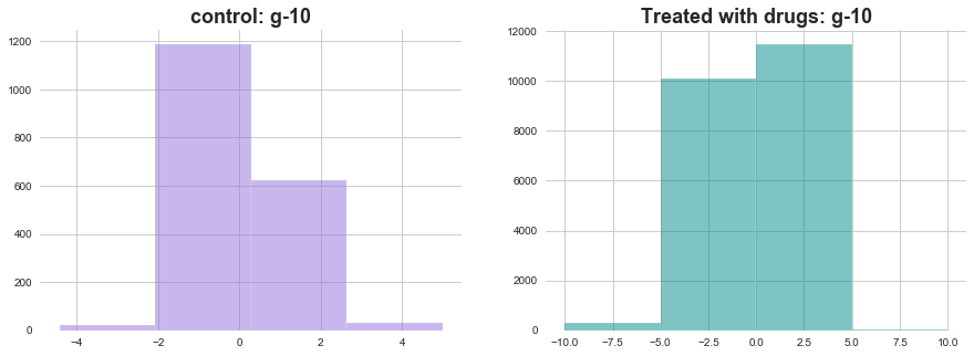
The distribution of activations of g-10 seems very different in both the situations. lets see some more examples
Code
    plt.style.use('seaborn')
    sns.set_style('whitegrid')
    fig = plt.figure(figsize=(15,5))

    ax1 = plt.subplot2grid((1,2),(0,0))
    plt.hist(with_out_drug['g-500'], bins=4, color='mediumpurple', alpha=0.5)
    plt.title(f'control: g-500', weight='bold', fontsize=18)

    ax1 = plt.subplot2grid((1,2),(0,1))
    plt.hist(with_drug['g-500'], bins=4, color='darkcyan', alpha=0.5)
    plt.title(f'Treated with drugs: g-500', weight='bold', fontsize=18)


    plt.style.use('seaborn')
    sns.set_style('whitegrid')
    fig = plt.figure(figsize=(15,5))

    ax1 = plt.subplot2grid((1,2),(0,0))
    plt.hist(with_out_drug['g-700'], bins=4, color='mediumpurple', alpha=0.5)
    plt.title(f'control: g-700', weight='bold', fontsize=18)

    ax1 = plt.subplot2grid((1,2),(0,1))
    plt.hist(with_drug['g-700'], bins=4, color='darkcyan', alpha=0.5)
    plt.title(f'Treated with drugs: g-700', weight='bold', fontsize=18)
    plt.show()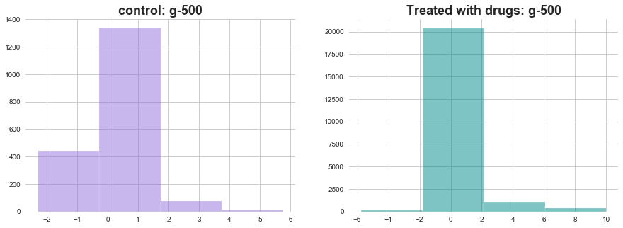
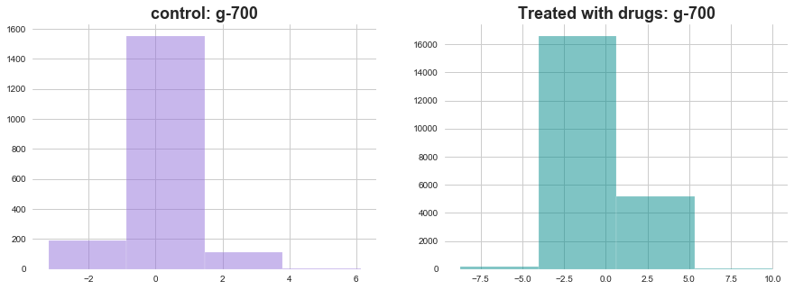
In both of the above plots effect of drugs on gene expression is visible through change in distributions
lets see effect of drug treatment time on gene expression
drug_24_hrs = with_drug[with_drug['cp_time']==24]
drug_48_hrs = with_drug[with_drug['cp_time']==48]
drug_72_hrs = with_drug[with_drug['cp_time']==72]
Code
def plot_feature_with_duration(f):
    plt.style.use('seaborn')
    sns.set_style('whitegrid')
    fig = plt.figure(figsize=(15,5))

    ax1 = plt.subplot2grid((1,3),(0,0))
    plt.hist(drug_24_hrs[f], bins=4, color='green', alpha=0.5)
    plt.title(f'feature: '+f+', duration: 24 hrs', weight='bold', fontsize=18)

    ax1 = plt.subplot2grid((1,3),(0,1))
    plt.hist(drug_48_hrs[f], bins=4, color='blue', alpha=0.5)
    plt.title(f'feature: '+f+', duration: 48 hrs', weight='bold', fontsize=18)

    ax1 = plt.subplot2grid((1,3),(0,2))
    plt.hist(drug_72_hrs[f], bins=4, color='red', alpha=0.5)
    plt.title(f'feature: '+f+', duration: 72 hrs', weight='bold', fontsize=18)

return plt.show()plot_feature_with_duration('g-10')
plot_feature_with_duration('g-250')
plot_feature_with_duration('g-500')
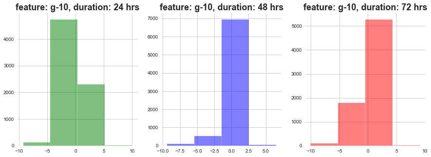
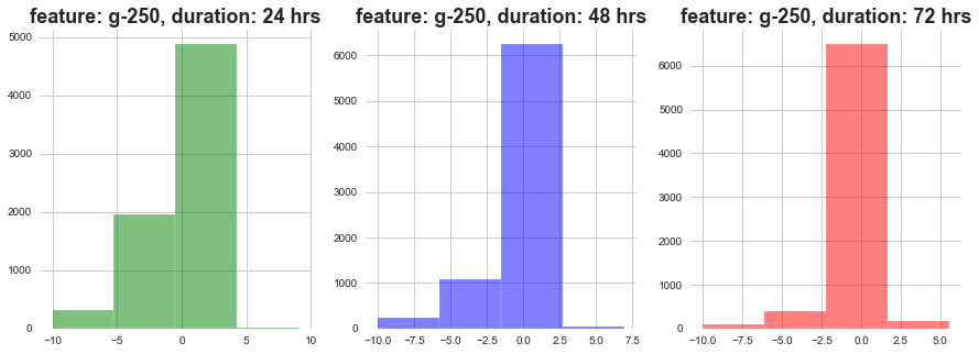
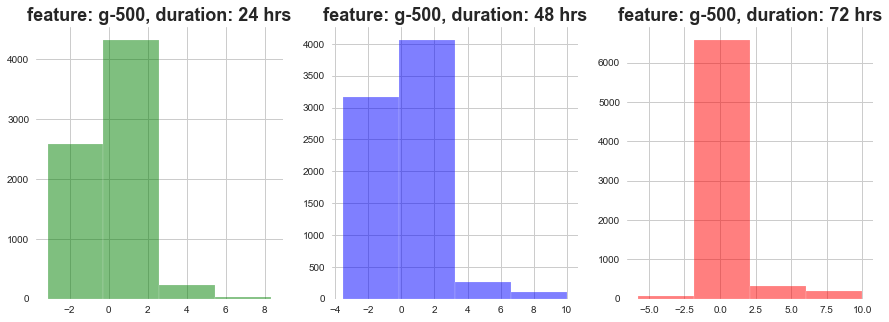
As show above, as the dosage duration changes the distribution of gene expression varies a lot.
lets see effect of drug level and duration on gene expression .
high_drug_24_hrs = with_drug[(with_drug['cp_time']==24) & (with_drug['cp_dose']=='D1')]
high_drug_48_hrs = with_drug[(with_drug['cp_time']==48) & (with_drug['cp_dose']=='D1')]
high_drug_72_hrs = with_drug[(with_drug['cp_time']==72) & (with_drug['cp_dose']=='D1')]

low_drug_24_hrs = with_drug[(with_drug['cp_time']==24) & (with_drug['cp_dose']=='D2')]
low_drug_48_hrs = with_drug[(with_drug['cp_time']==48) & (with_drug['cp_dose']=='D2')]
low_drug_72_hrs = with_drug[(with_drug['cp_time']==72) & (with_drug['cp_dose']=='D2')]
Code
def plot_feature_with_duration_level(f):
    plt.style.use('seaborn')
    sns.set_style('whitegrid')
    fig = plt.figure(figsize=(15,5))

    ax1 = plt.subplot2grid((1,3),(0,0))
    plt.hist(high_drug_24_hrs[f], bins=4, color='red', alpha=0.5)
    plt.hist(low_drug_24_hrs[f], bins=4, color='green', alpha=0.5)
    plt.title(f'feature: '+f+', duration: 24 hrs', weight='bold', fontsize=18)

    ax1 = plt.subplot2grid((1,3),(0,1))
    plt.hist(high_drug_48_hrs[f], bins=4, color='red', alpha=0.5)
    plt.hist(low_drug_48_hrs[f], bins=4, color='green', alpha=0.5)
    plt.title(f'feature: '+f+', duration: 48 hrs', weight='bold', fontsize=18)

    ax1 = plt.subplot2grid((1,3),(0,2))
    plt.hist(high_drug_72_hrs[f], bins=4, color='red', alpha=0.5)
    plt.hist(low_drug_72_hrs[f], bins=4, color='green', alpha=0.5)
    plt.title(f'feature: '+f+', duration: 72 hrs', weight='bold', fontsize=18)

return plt.show()plot_feature_with_duration_level('g-10')
plot_feature_with_duration_level('g-250')
plot_feature_with_duration_level('g-500')
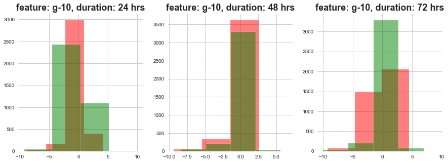
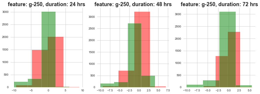
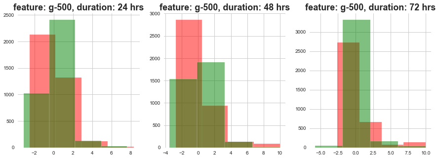
Red signifies high level dose and Green signifies low level dose
1) The distributions at high ad loow dosages overlap a lot.
3.4 Relation between features and targets
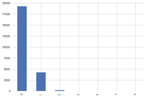
targets_scored[targets_scored.columns[1:]].sum(axis=1).value_counts().plot(kind='bar')
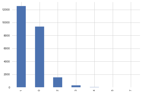
Most of the samples are with MoA count 1
MoA_count_cat = list([])
for i in targets_scored[targets_scored.columns[1:]].sum(axis=1):
    if i==0:
        MoA_count_cat.append('0')
    if i==1:
        MoA_count_cat.append('1')
    if i==2:
        MoA_count_cat.append('2')
    elif i>2:
        MoA_count_cat.append('3+')
MoA_count_cat = pd.DataFrame(list(zip(list(targets_scored['sig_id']), MoA_count_cat)), columns =['sig_id', 'Moa_count_cat'])
features = features.merge(MoA_count_cat, how='left', on='sig_id')
lets see relation between targets and drug level
high_drug_MoA_cat = features[features['cp_dose']=='D1']['Moa_count_cat']
low_drug_MoA_cat = features[features['cp_dose']=='D2']['Moa_count_cat']
Code
plt.style.use('seaborn')
sns.set_style('whitegrid')
fig = plt.figure(figsize=(15,5))

ax1 = plt.subplot2grid((1,2),(0,0))
plt.hist(high_drug_MoA_cat, color='red', alpha=0.5)
plt.title(f'high drugs', weight='bold', fontsize=18)

ax1 = plt.subplot2grid((1,2),(0,1))
plt.hist(low_drug_MoA_cat, color='blue', alpha=0.5)
plt.title(f'low drugs', weight='bold', fontsize=18)
plt.show()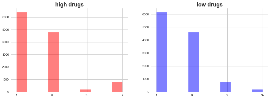
In both high ad low level of drugs dosage, MoA count 1 add 0 domiates. There are few occasions when more than 2 MoA occured.
lets see relation between targets and dosage duration
hours_24_MoA_cat = features[features['cp_time']==24]['Moa_count_cat']
hours_48_MoA_cat = features[features['cp_time']==48]['Moa_count_cat']
hours_72_MoA_cat = features[features['cp_time']==72]['Moa_count_cat']
Code
plt.style.use('seaborn')
sns.set_style('whitegrid')
fig = plt.figure(figsize=(15,5))

ax1 = plt.subplot2grid((1,3),(0,0))
plt.hist(hours_24_MoA_cat, color='red', alpha=0.5)
plt.title(f'duration 24 hours', weight='bold', fontsize=18)

ax1 = plt.subplot2grid((1,3),(0,1))
plt.hist(hours_48_MoA_cat, color='blue', alpha=0.5)
plt.title(f'duration 48 hours', weight='bold', fontsize=18)

ax1 = plt.subplot2grid((1,3),(0,2))
plt.hist(hours_72_MoA_cat, color='green', alpha=0.5)
plt.title(f'duration 72 hours', weight='bold', fontsize=18)

plt.show()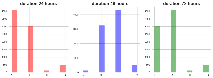
1) In all of the dosage durations MoA count 0 and 1 dominates followed by 2 ad 3
lets see relation between targets and gene expression distribution
Moa_count_cat_0 = features[features['Moa_count_cat']=='0']
Moa_count_cat_1 = features[features['Moa_count_cat']=='1']
Moa_count_cat_2 = features[features['Moa_count_cat']=='2']
Moa_count_cat_3 = features[features['Moa_count_cat']=='3+']
Code
def plot_feature_with_Moa_count_cat(f):
    plt.style.use('seaborn')
    sns.set_style('whitegrid')
    fig = plt.figure(figsize=(20,5))

    ax1 = plt.subplot2grid((1,4),(0,0))
    plt.hist(Moa_count_cat_0[f], color='red', alpha=0.5)
    plt.title('MoA count 0, feature: '+f, weight='bold', fontsize=18)

    ax1 = plt.subplot2grid((1,4),(0,1))
    plt.hist(Moa_count_cat_1[f], color='blue', alpha=0.5)
    plt.title('MoA count 1, feature: '+f, weight='bold', fontsize=18)

    ax1 = plt.subplot2grid((1,4),(0,2))
    plt.hist(Moa_count_cat_2[f], color='green', alpha=0.5)
    plt.title('MoA count 2, feature: '+f, weight='bold', fontsize=18)

    ax1 = plt.subplot2grid((1,4),(0,3))
    plt.hist(Moa_count_cat_3[f], color='pink', alpha=0.5)
    plt.title('MoA count >= 3, feature: '+f, weight='bold', fontsize=18)

return plt.show()plot_feature_with_Moa_count_cat('g-0')
plot_feature_with_Moa_count_cat('g-300')
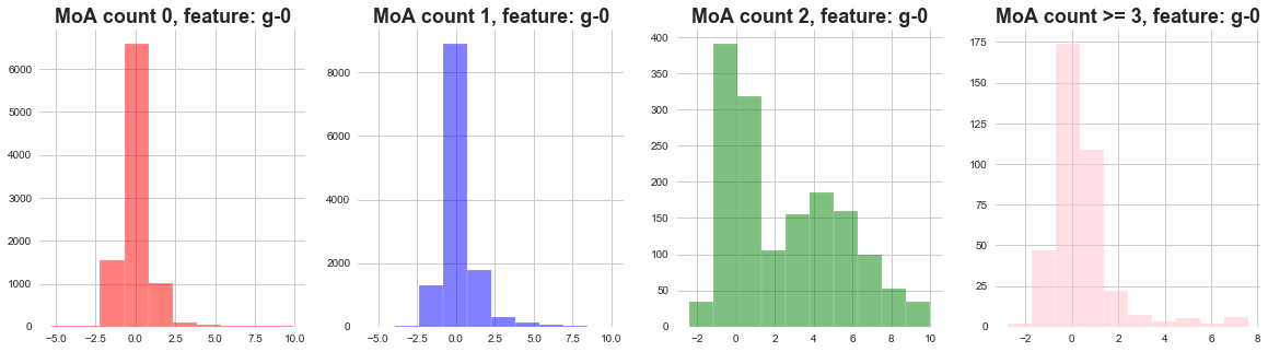
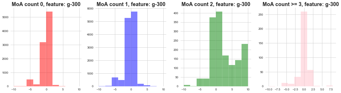
1) The distribution of gene expressions MoA count 0, 1, 3 seems to be narrow .
2) The distribution of gene expressions MoA count 2 seems to be wide .
3) We can say that when there are less MoA actvations most of the gene expressions remain concentrated.
4) When there are more gene activations, the gene expressions are widely distributed.
lets see relation between targets and cell viability distribution
plot_feature_with_Moa_count_cat('c-0')
plot_feature_with_Moa_count_cat('c-80')
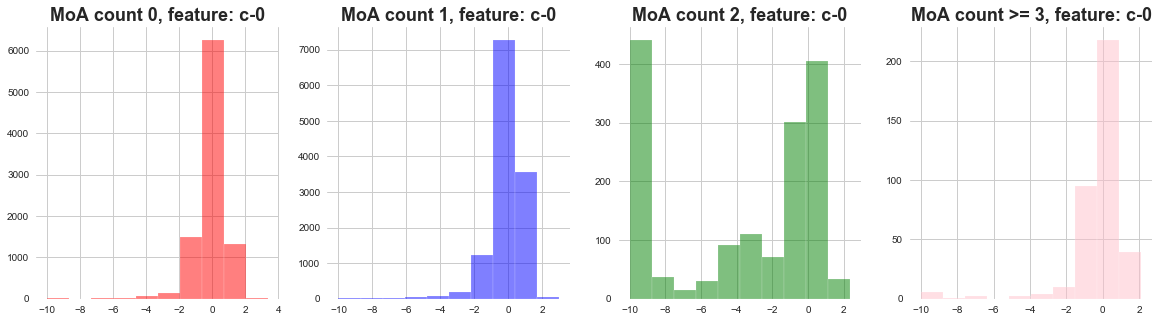
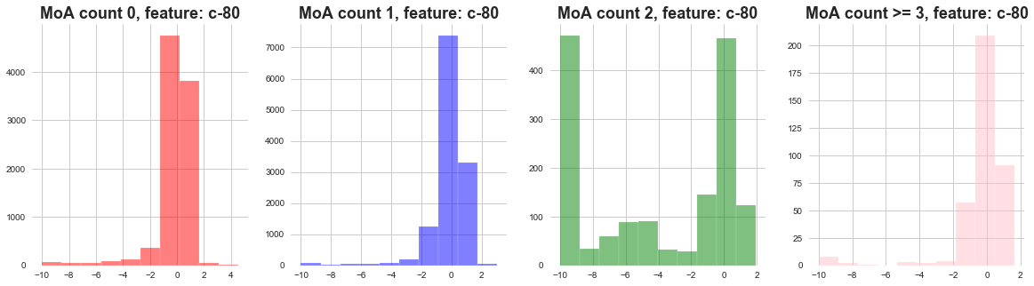
1) The distribution of cell viability feature MoA count 0 and 1 seems to be following narrow distribution.
2) The distribution of cell viability feature MoA count 2 seems to be following wide distribution.
4. PCA
4.1 PCA on gene expression.
from sklearn.decomposition import PCA
pca = PCA(n_components=2)
cols = [ col for col in features.columns if 'g-' in col ]
genes_trasformed = pca.fit_transform(features[cols].values)
genes_trasformed
array([[ -8.27039603,  -0.44112646],
       [ -6.62560814,   3.42833735],
       [ -1.72725065,   2.33645648],
       ...,
       [ -6.57892286,  -1.34231503],
       [  7.50955722, -20.86674869],
       [  2.72771011,   4.66340611]])
Code for PCA
def plot_PCA(x, y, labels):
fig, ax = plt.subplots()
colormap = cm.viridis
unique_labels = list(set(labels))
color_palette = [colors.rgb2hex(colormap(i)) for i in np.linspace(0, 0.9, len(unique_labels))]
color_dict = dict()
for color, label in zip(color_palette, unique_labels):
color_dict[label] = color
color_list = [ color_dict[i] for i in labels ]
plt.scatter(x, y,
c=color_list, edgecolor='none', alpha=0.5,
)
patches = [ mpatches.Patch(color=value, label=key) for key, value in color_dict.items() ]
plt.legend(handles = patches)
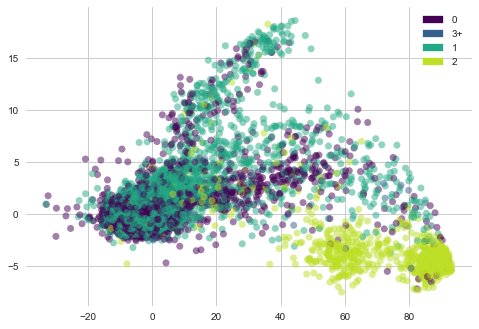
return plt.show()lets see “Moa_count_cat” i-e MoA count features distribution with PCA vectors of gene expression.
plot_PCA(list(genes_trasformed.T[0]), list(genes_trasformed.T[1]), list(features['Moa_count_cat']))
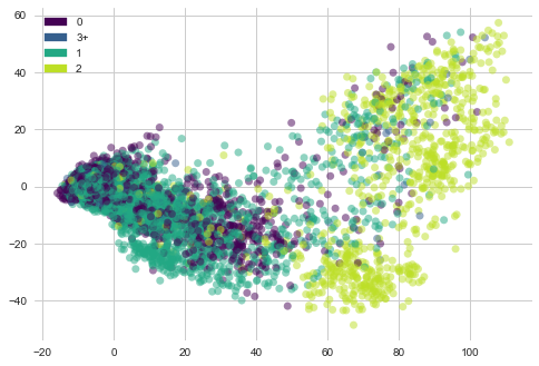
1) Most of the genes samples with 2 MoA are towards right side in the plot but they are sparsely placed.
2) Gene samples with count 3, 1 and 2 are concentrated towards left side.
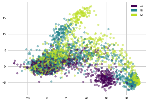
lets see “cp_time” i-e Dosage duration count features distribution with PCA vectors of gene expression
plot_PCA(list(genes_trasformed.T[0]), list(genes_trasformed.T[1]), list(features['cp_time']))
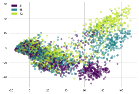
1) Most of the dosage of 24 hours duration lie at bottom of the plot forming a cluster.
2) Dosages of duration 48 and 72 hours are sparsely distributed
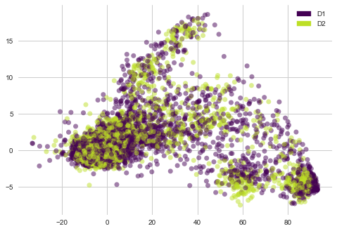
lets see “cp_dose” i-e Dosage duration count features distribution with PCA vectors of gene expression
plot_PCA(list(genes_trasformed.T[0]), list(genes_trasformed.T[1]), list(features['cp_dose']))
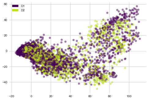
1) There are no clear clusters here.
4.2 PCA on cell viability
cols = [ col for col in features.columns if 'c-' in col ]
cells_trasformed = pca.fit_transform(features[cols].values)
cells_trasformed
array([[-7.33992069,  0.60099038],
       [-7.4773736 , -0.75247805],
       [-2.30350659,  0.22193864],
       ...,
       [-8.35785114,  0.46543437],
       [-7.89501453,  0.16325937],
       [25.12325042,  3.49027281]])
lets see “Moa_count_cat” i-e MoA count features distribution with PCA vectors of cell viability
plot_PCA(list(cells_trasformed.T[0]), list(cells_trasformed.T[1]), list(features['Moa_count_cat']))
1) Cell viability with MoA count 2 is clustered at bottom right corner.
2) Cell viability with MoA cout 0,1 ad 3 are sparsely placed.
lets see “cp_time” i-e Dosage duration count features distribution with PCA vectors of cell viability
plot_PCA(list(cells_trasformed.T[0]), list(cells_trasformed.T[1]), list(features['cp_time']))
1) Cell viability with dosage duratio of 24 hours is clustered at bottom .
2) Cell viability with other dosage durations is sparsely oriented.
lets see “cp_dose” i-e Dosage duration count features distribution with PCA vectors of cell viability
plot_PCA(list(cells_trasformed.T[0]), list(cells_trasformed.T[1]), list(features['cp_dose']))
1) There are no clear clusters here.
5. Non-scored targets
sum_of_MoA = [ sum(targets_non_scored[i]) for i in targets_non_scored.columns if i != 'sig_id' ]
res = sorted(zip(targets_non_scored.columns[1:], sum_of_MoA), key = lambda x: x[1])
MoA, count = zip(*res)
plt.figure(figsize=(7,7))
plt.scatter(count[-20:], MoA[-20:], color=sns.color_palette('Reds',20))
plt.title('Targets with higher presence in train samples', weight='bold', fontsize=15)
plt.xticks(weight='bold')
plt.yticks(weight='bold')
plt.xlabel('Count', fontsize=13)
plt.show()
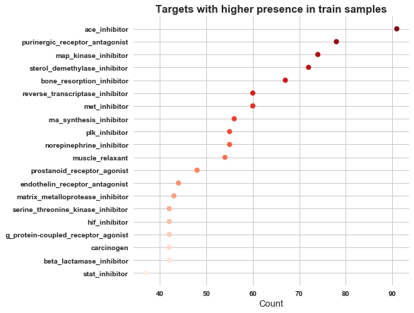
In non scored targets ace_inhibitor has got highest occurence, followed by purinergic_receptor_antagonist.
targets_non_scored[targets_non_scored.columns[1:]].sum(axis=1).value_counts().plot(kind='bar')
<matplotlib.axes._subplots.AxesSubplot at 0x7fb10d664110>
As we can see in above plot most of the non scored samples have 0 MoA. We will neglect this file from further analysis
6. EDA for MoA activated or not
We already know that all of the cells which were given drug through ctl_vehicle did not genrate MoA. Lets try to find out if there is any way to segregate between samples with no MoA activation and one with MoA activation if the vehicle is trt_cp.
MoA_active = [False if i=='0' else True for i in features['Moa_count_cat']]
features['MoA_active'] = MoA_active
features.head()
| sig_id | cp_type | cp_time | cp_dose | g-0 | g-1 | g-2 | g-3 | g-4 | g-5 | ... | c-92 | c-93 | c-94 | c-95 | c-96 | c-97 | c-98 | c-99 | Moa_count_cat | MoA_active | |
|---|---|---|---|---|---|---|---|---|---|---|---|---|---|---|---|---|---|---|---|---|---|
| 0 | id_000644bb2 | trt_cp | 24 | D1 | 1.0620 | 0.5577 | -0.2479 | -0.6208 | -0.1944 | -1.0120 | ... | 0.8076 | 0.5523 | -0.1912 | 0.6584 | -0.3981 | 0.2139 | 0.3801 | 0.4176 | 1 | True |
| 1 | id_000779bfc | trt_cp | 72 | D1 | 0.0743 | 0.4087 | 0.2991 | 0.0604 | 1.0190 | 0.5207 | ... | 0.4708 | 0.0230 | 0.2957 | 0.4899 | 0.1522 | 0.1241 | 0.6077 | 0.7371 | 0 | False |
| 2 | id_000a6266a | trt_cp | 48 | D1 | 0.6280 | 0.5817 | 1.5540 | -0.0764 | -0.0323 | 1.2390 | ... | 0.6103 | 0.0223 | -1.3240 | -0.3174 | -0.6417 | -0.2187 | -1.4080 | 0.6931 | 3+ | True |
| 3 | id_0015fd391 | trt_cp | 48 | D1 | -0.5138 | -0.2491 | -0.2656 | 0.5288 | 4.0620 | -0.8095 | ... | -5.6300 | -1.3780 | -0.8632 | -1.2880 | -1.6210 | -0.8784 | -0.3876 | -0.8154 | 0 | False |
| 4 | id_001626bd3 | trt_cp | 72 | D2 | -0.3254 | -0.4009 | 0.9700 | 0.6919 | 1.4180 | -0.8244 | ... | 0.6670 | 1.0690 | 0.5523 | -0.3031 | 0.1094 | 0.2885 | -0.3786 | 0.7125 | 1 | True |
5 rows × 878 columns
lets check if there is any correlation between our categorical variables and MoA_active feature
from collections import Counter
import math
import scipy.stats as ss
Code for Categorical correlation
# reference: https://towardsdatascience.com/the-search-for-categorical-correlation-a1cf7f1888c9

# theilu correlation between categorical variables
def conditional_entropy(x,y):
    # entropy of x given y
    y_counter = Counter(y)
    xy_counter = Counter(list(zip(x,y)))
    total_occurrences = sum(y_counter.values())
    entropy = 0
    for xy in xy_counter.keys():
        p_xy = xy_counter[xy] / total_occurrences
        p_y = y_counter[xy[1]] / total_occurrences
        entropy += p_xy * math.log(p_y/p_xy)
    return entropy

def theil_u(x,y):
    s_xy = conditional_entropy(x,y)
    x_counter = Counter(x)
    total_occurrences = sum(x_counter.values())
    p_x = list(map(lambda n: n/total_occurrences, x_counter.values()))
    s_x = ss.entropy(p_x)
    if s_x == 0:
        return 1
    else:
return (s_x - s_xy) / s_xtheil_u(features['cp_time'].tolist(), features['Moa_count_cat'].tolist())
4.095894564328272e-06
theil_u(features['cp_type'].tolist(), features['Moa_count_cat'].tolist())
0.285150967263478
theil_u(features['cp_dose'].tolist(), features['Moa_count_cat'].tolist())
3.574176402579373e-06
The correlation between categorical variables and our MoA_active is not much stronger
Code for correlation between categorical and continuous variable
def correlation_ratio(categories, measurements):
    fcat, _ = pd.factorize(categories)
    cat_num = np.max(fcat)+1
    y_avg_array = np.zeros(cat_num)
    n_array = np.zeros(cat_num)
    for i in range(0,cat_num):
        cat_measures = measurements[np.argwhere(fcat == i).flatten()]
        n_array[i] = len(cat_measures)
        y_avg_array[i] = np.average(cat_measures)
    y_total_avg = np.sum(np.multiply(y_avg_array,n_array))/np.sum(n_array)
    numerator = np.sum(np.multiply(n_array,np.power(np.subtract(y_avg_array,y_total_avg),2)))
    denominator = np.sum(np.power(np.subtract(measurements,y_total_avg),2))
    if numerator == 0:
        eta = 0.0
    else:
        eta = np.sqrt(numerator/denominator)
    return eta
corrs = list([])
for i in g_cols:
corr= correlation_ratio(features['MoA_active'], features[i])
corrs.append(corr)
max(corrs)
0.1934384629317824
corrs = list([])
for i in c_cols:
    corr= correlation_ratio(features['MoA_active'], features[i])
    corrs.append(corr)
max(corrs)
0.1530758539280619
The correlation between continuous variables and our MoA_active is not much stronger.
| Blog part |
|---|
| 1. MoA problem definition link |
| 3. Feature Engineering and Baseline model for MoA |
| 4. ML techniques on MoA dataset |
| 5. DL techniques on MoA dataset |